When Uniregistry launched its Uniregistry Market, one of the biggest changes was its landing page designs. The new landing pages were devoid of graphic headers that showed images related to the PPC links, and there were some other major changes to the font and layout.
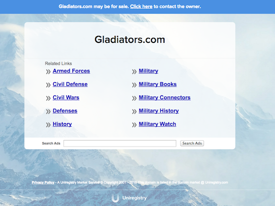
One of the first things I noticed was that the bright green offer bar at the top of landing pages was changed to blue. This seemed to be a bit counterproductive since the blue seems to blend into the rest of the landing page, and mentioning that the domain name may be available for sale is important for people who make a living selling domain names.
A couple of weeks ago, Frank Schilling, CEO of Uniregistry, reassured clients by saying that there was just a marginal difference in offers received since the change was made. In fact, he said “It was up marginally in the first week I’d say 3–5% .. “definitely” up tho week to week across the board.”
I was just checking on something, and I see that Uniregistry has brought back its bright green offer bar at the top of the page: